Customising Your Salesforce Dashboards for Easy Reporting
The ability to build a dashboard from scratch (in Lightning Experience) means customising and displaying data exactly as you need it. Here's how.


4 mins

Book a consultation to discuss:
Integrating 3rd-party platforms and implementation
Auditing data and segmentation in HubSpot and Salesforce
Underperforming journeys and automations
Reducing license costs and inefficiencies
Campaign attribution modelling & ROI
AI readiness, Agent POC's and Claude integration
Book a 15-30 mins call to see if we are a mutual fit.
The ability to build a dashboard from scratch (in Lightning Experience) means customising and displaying data exactly as you need it. Here's how.
4 mins
In today's data-driven world, businesses rely on robust tools to make informed marketing decisions and monitor performance effectively. Salesforce empowers organisations with a wide range of features, and among them, Salesforce dashboards stand out as a crucial tool for fast data visualisation and analysis.
The point of setting up Salesforce dashboards a certain way is to deliver information to your users in the ways that work best for them. This makes reporting easier, and much more user-friendly.
Dashboards provide you with a graphical view of the Salesforce data in reports. The components provide a snapshot of key metrics and performance indicators from your Salesforce data.
You’re undoubtedly spending a lot of time in Salesforce, so why not take that one extra step to customise your dashboards so they are optimised for easy reporting?
**Note - Your report must be grouped by at least one field in order to choose a new chart component, if not this will display as the standard table type component**
To create a Salesforce Dashboard navigate to the Dashboards tab, click New Dashboard to create or click on an existing dashboard to edit:
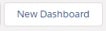

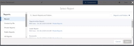
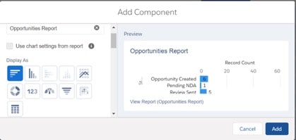
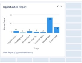

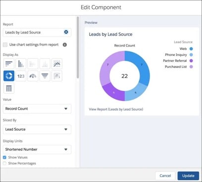
Image source: salesforce.com
You can further customise by changing the column layout by:
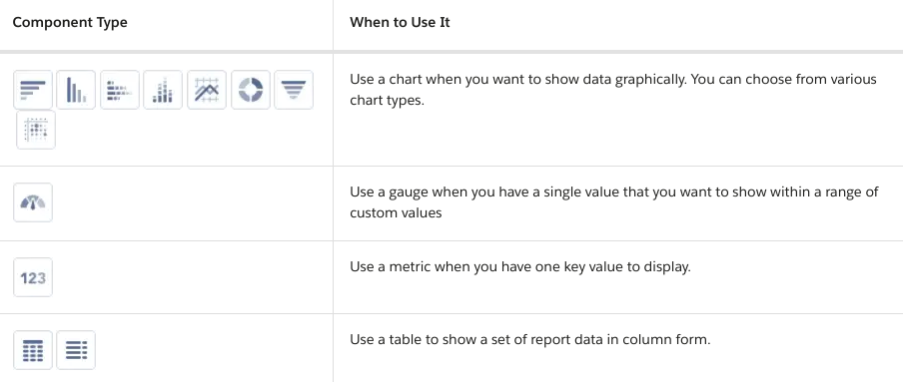
In the lightning dashboards, each component has a series of properties that help you customise it until it shows exactly the data that you want. Salesforce offers further documentation surrounding ideas about when to use each type of component here.
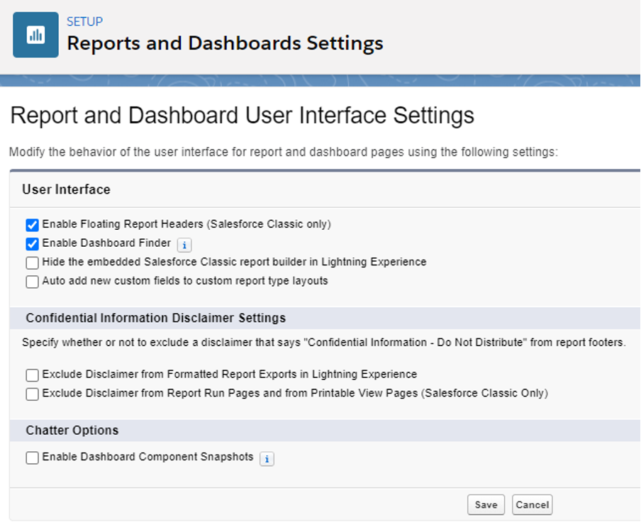
Provide convenience and ease of use by enabling different user interface features for reports and dashboards.
These features don’t affect your data but can provide a more user-friendly experience:
If you haven’t already, removing the visibility of the Salesforce Classic report builder, it maintains the sleekness of the complete Lightning experience. Salesforce data can be analysed intuitively within Lightning
Hide by following these steps:
Historical trend reporting allows you to track how field values have changed over time. If you need to track changes that happen day-to-day, this is the perfect feature for you.
Historical reporting gives you 5 snapshot dates and the option to trace up to 8 fields on the Opportunity object and up to 3 custom objects.
Once this is enabled, a new report type is available when you create future reports.
Follow our step-by-step below:
Use the filters under Configure Data for Opportunities, Cases, and custom objects. For Forecasting Items, the available data is preselected.
These fields are preselected for Forecasting, however, you can select Opportunity fields. 5 fields are preselected: Amount, Close Date, Forecast Category, Probability, and Stage. You can add 3 more.
If you’re having troubles customising your Salesforce dashboards, or in Sales Cloud in general – we’re here to help. Feel free to send us a message about our Salesforce consulting and admin support options.
The ability to build a dashboard from scratch (in Lightning Experience) means customising and displaying data exactly as you need it, thereby delivering key analytics to users right away. This makes reporting easier and user-friendly.
Ready to explore the world of Salesforce dashboards and how to leverage their potential to drive success in your business? Before we jump into instructions for building, let’s cover the basics of an effective dashboard.
Creating a compelling Salesforce dashboard is an art and science. Follow this process to design a dashboard that does what you need.
Define your objectives: Before you start building your dashboard, determine your specific goals. What do you want to achieve with this dashboard? Understanding your objectives is the first step to success.
Choose the right metrics: Document the most relevant metrics that align with your business objectives. These should be KPIs that provide insights into performance and help you track progress.
Data source and integration: Ensure your data sources are integrated with Salesforce. Data should flow seamlessly into your dashboard. Leverage Salesforce Connectors and integrations to achieve this.
Reports: Build meaningful reports that represent only the data you need to visualise. Your report must be grouped by at least one field in order to choose a new chart component, if not this will display as the standard table-type component.
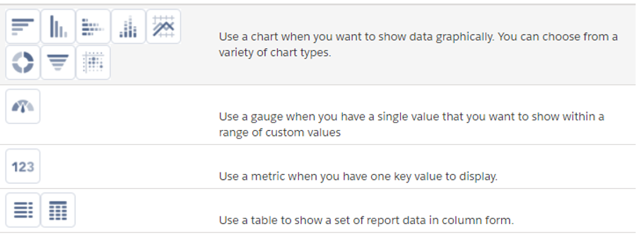
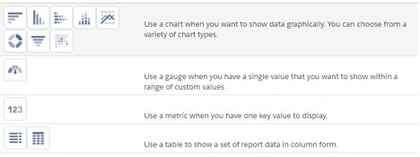
Widget selection: Choose the right widgets to represent your data. Salesforce offers a variety of widgets, including charts, tables, and gauges. Pick those that are suited to your data and metric.
Layout and organisation: Design a simple and intuitive layout. Keep it clean and organised, with a logical flow from left to right and top to bottom. Group related components together.
Colour and style: Use colour strategically to emphasise key data points. Make sure your dashboard style aligns with your organisation's branding, this helps with adoption.
Interactivity: Create interactive dashboards that allow users to drill down into data for deeper insights. Filters and dynamic components enhance the user experience.
Testing and iteration: Before deploying, thoroughly test your dashboard with users to ensure it meets their needs. Be open to feedback and iterate based on their input.
Identify who needs access: In many cases, you’ll want to share dashboards across the team for maximum visibility. But there will be some dashboards, like topline sales goal tracking, that may not be helpful to reps in their day-to-day work.
Regularly update your dashboard to reflect changing business needs and priorities.
Make use of dashboard templates provided by Salesforce to save time and effort
Keep your dashboards uncluttered; too much information can overwhelm users.
Ensure your data is clean and accurate for reliable insights.
Train your users on how to read and interact with the dashboard effectively.
Dashboards are shared via folders so ensure that you save your dashboard in an appropriate folder.
The same report and data can be used in one or multiple dashboard components.
Dashboards can only support a maximum of 20 components.
Availability and features of Salesforce dashboards can vary depending on the Salesforce edition you are using. More information can be found here.
In our ‘How to Measure ROI Using Pardot’ eBook, you’ll find a detailed list of all the steps you need to take to fully track and report on marketing attribution and return on investment.
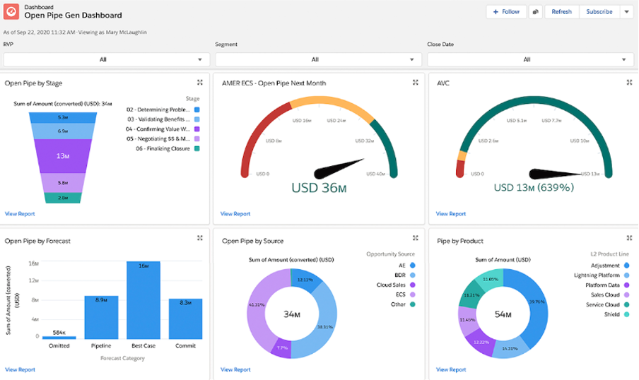
Dashboard components display a visual representation of your data from one or multiple reports. This is an out-of-the-box feature. Dashboards are supported in both Classic and Lightning Experience (as seen below).
Components are the building blocks of your new dashboard, with these blocks, you will be able to visualise any data from reports. Remember, meaningful data is important and will help increase adoption.
You can see above that ‘Stacked’ and ‘Charts’ are unavailable for me to choose, they are greyed out because I have only grouped my data by one grouping.
Choosing the right component chart can be daunting, however, if you get this right you will increase adoption across your teams.
Gauge charts are great for tracking against sales targets for a sales rep.
A doughnut chart is ideal for displaying Opportunities by stage.
Bar and column charts can display sales value by Account.
Maria is a Sales Manager at Quntumn Blinds. Maria wants to be able to track how her team is performing on a day-by-day basis. First, she wants to be able to visualise the total number of Opportunities across her team, understand who are the top contributors, and see a breakdown by stage for each sales rep.
Maria remembers a great blog she read on the MarCloud website and knows that she needs to first create the Salesforce reports and store them in a place her audience can access before designing her dashboard.
Side note: Whilst this use case is straightforward and only requires one report of data, as you build more complicated dashboards you may need various reports to accomplish your goals.
See how Maria could set up her dashboard with this video tutorial:
<iframe src="https://www.iorad.com/player/2269320/Marcloud---How-to-Dashboards-1-Tutorial?iframeHash=trysteps-1&src=iframe&oembed=1" width="100%" height="500px" style="width: 100%; height: 500px; border-bottom: 1px solid #ccc;" referrerpolicy="strict-origin-when-cross-origin" frameborder="0" webkitallowfullscreen="webkitallowfullscreen" mozallowfullscreen="mozallowfullscreen" allowfullscreen="allowfullscreen" allow="camera; microphone; clipboard-write"></iframe>
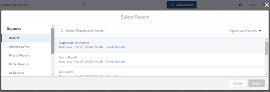
Navigate to the Dashboards tab, click ‘New Dashboard’ to create or click on an existing dashboard to edit:
To add a component to the dashboard, press + Component.
Choose a source report for the component, then press ‘Select’.
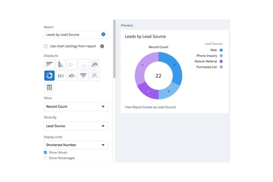
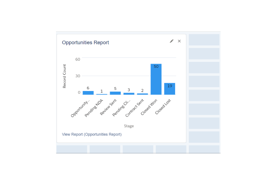
4. From here you can choose a Chart Report and customise how the component displays data, then press Add. The component will then appear on the grid, like the screenshot below. You can arrange or resize the component as you like within the edit grid.
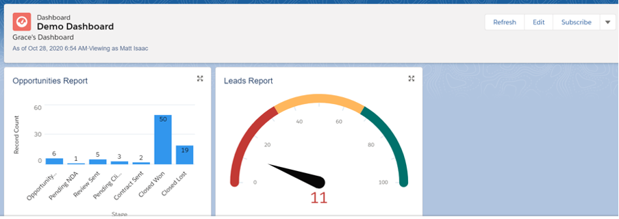
5. You can keep on adding components to the dashboard and they will display as per the below screenshot.
You can edit an existing dashboard by clicking the pencil icon on the component or add a new component by clicking + Component.
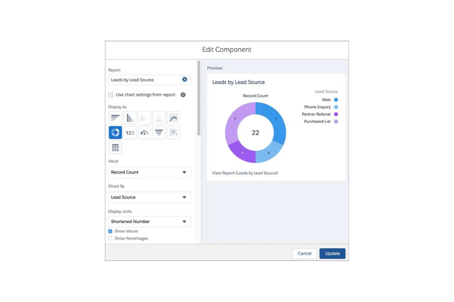
‘Display Units’ can be changed to display as a shortened number, full number, hundreds, thousands etc.
You can check the ‘Show Values’ and ‘Show Percentages' to display these also.
You can amend the ‘Measure filter’ to display a record count with a different value.
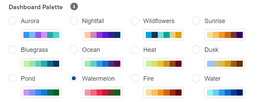
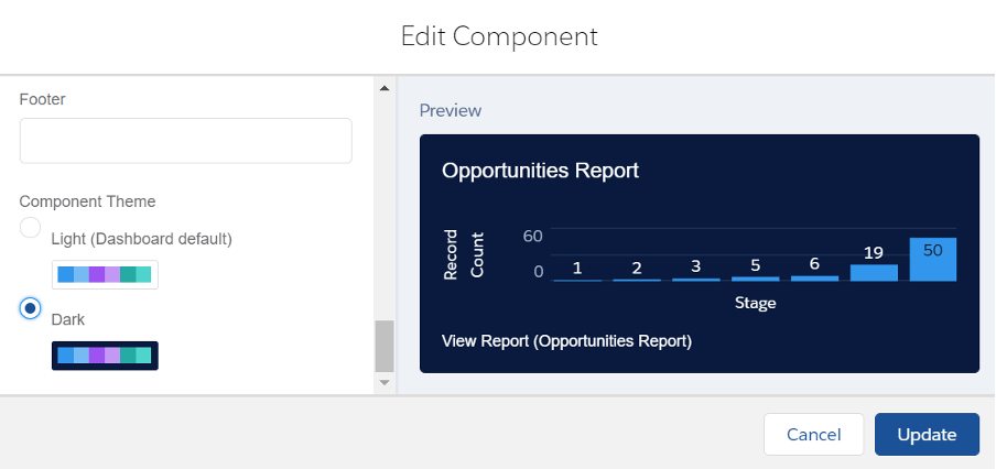
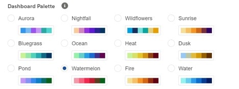
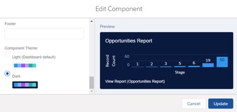
There are multiple options for the colour palette of your dashboard, as well as changing the theme of the component to be dark or light!
Simply select your preference and click ‘Update’ to save your changes.
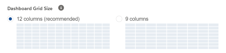
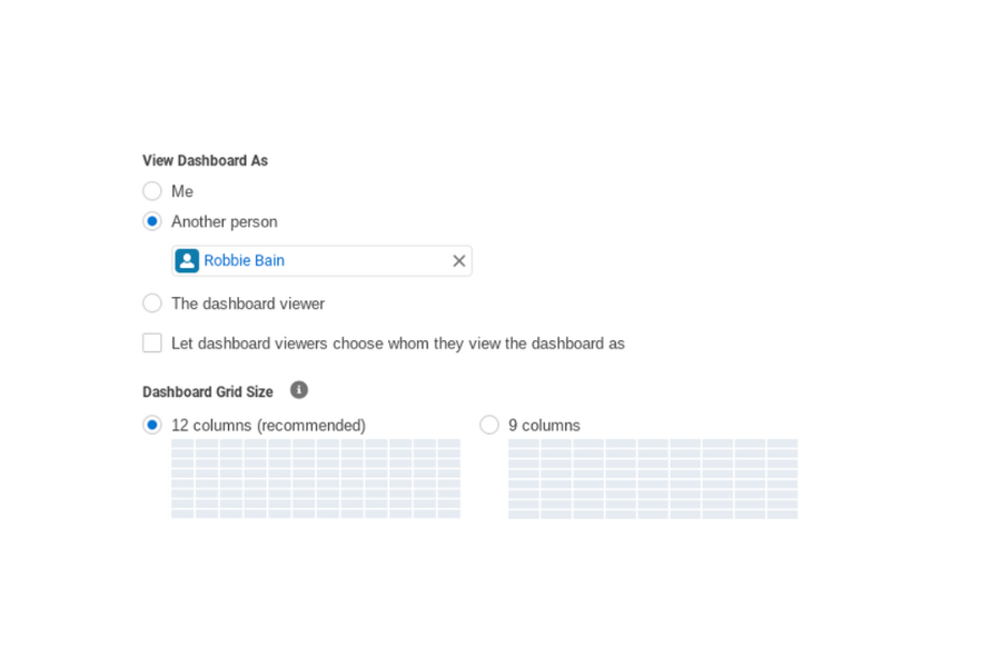
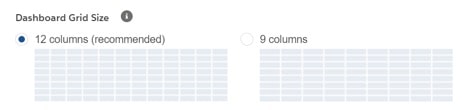
Navigate to the ‘Properties’ menu by clicking the gear icon.
Under ‘Dashboard Grid Size’ choose 12 columns or 9 columns.
Click Save.
In Lightning dashboards, each component has a series of properties that help you customise until it shows exactly the data that you want. Salesforce provides further documentation with ideas about when to use each type of component here.
Provide convenience and ease of use by enabling different user interface features for reports and dashboards. These features don’t affect your data but can provide a more user-friendly experience:
Let users see report headers while scrolling (Classic only).
Help users find dashboards quickly (Dashboard Finder).
Exclude the confidential information disclaimer from reports.
If you haven’t already, removing the visibility of the Salesforce Classic report builder maintains the sleekness of the complete Lightning experience. Salesforce data can then be analysed more easily within Lightning.
Navigate to ‘Setup’ and search ‘Reports’ in the ‘Quick Find’ box and select ‘Reports and Dashboards Settings’.
Select ‘Hide the embedded Salesforce Classic report builder in Lightning Experience’.
Click ‘Save’.
Historical trend reporting allows you to track how field values have changed over time. If you need to track changes that happen day-to-day, this is the perfect feature for you.
Historical reporting gives you 5 snapshot dates and the option to trace up to 8 fields on the Opportunity object and up to 3 custom objects. Once this is enabled, a new report type is available when you create future reports.
Navigate to ‘Setup’, search ‘Historical Trending’ in the ‘Quick Find’ box.
Select ‘Historical Trending’.
Then select the object that you want to do historical trend reporting on. You can then select one object from: Opportunities, Cases, Forecasting Items, and up to 3 custom objects.
Select ‘Enable Historical Trending’.
Optional: As retaining historical data increases storage requirements, you can select the data you want to capture. Use the filters under Configure Data for Opportunities, Cases, and custom objects. For Forecasting Items, the available data is preselected.
You can choose up to 8 fields to make available for historical trend reporting in ‘Select Fields’. These fields are preselected for Forecasting, however, you can select Opportunity fields. 5 fields are preselected: Amount, Close Date, Forecast Category, Probability, and Stage. You can add 3 more.
Click ‘Save’.
An out-of-the-box feature that is worth noting is the ability to make your dashboards dynamic. This feature allows you to choose from various options, such as the running use (Default). This can be changed and can be very useful when operating a private sharing model for certain objects.
The other options listed above can further enhance the user's experience and the data the dashboard displays.
View as ‘Another Person’: This can be any active user with access to run reports and dashboards. With this option, the viewer will be able to see all data that the named user has access to, so tread carefully with this option!
The dashboard viewer: This option automatically runs the dashboard as the user viewing the dashboard, meaning they will only see data and fields they have access to, including read access.
If you’re having trouble customising your Salesforce dashboards, or with Sales Cloud in general, we’re here to help. Feel free to send us a message about our Salesforce consulting and admin support options.
With 28 years of experience in the British Army and a successful track record as a Salesforce Solution Engineer, Robbie brings a unique blend of leadership and technical expertise to the table. His ability to translate customer needs into innovative solutions, coupled with expertise in managing complex projects, makes him a valuable asset in driving customer success within the Salesforce ecosystem or as an administrator.
More by Robbie BainProving ROI is the holy grail for marketers. In our ‘How to Measure ROI Using Pardot’ eBook, you’ll find a detailed list of all the steps you need to take to fully track and report on marketing attribution and return on investment. If you can make it through the guide with every single checkbox ticked, you can consider yourself a true expert!
Download nowAccount Engagement (Pardot) is now a dwindling skillset as Salesforce has shown its strongest signal that the platform is no longer a part of the roadmap. The certification is being phased out, which means a 'Pardot consultant' could instead become an Agentforce marketer.
Tom Ryan
5 mins
When MarCloud audits a HubSpot portal, lifecycle stages are one of the things we look at. Pretty frequently, they’re either misconfigured or not being used at all. Setting HubSpot up correctly requires a conversation between marketing, sales, and revenue operations teams because any gap in alignment will cause issues in HubSpot. In this case, it’s lifecycle stages that reflect internal assumptions rather than true buyer behaviour, and damage reporting.
Tom Ryan
7 mins
There are two ways most HubSpot users handle custom properties. The first is avoiding them entirely because the platform already feels complicated. The second is going in without a plan and creating sixty fields with inconsistent names, several of which duplicate each other and most of which are never reliably populated. Whether you fall into the avoidant or abundant approach, both can leave you with a problematic HubSpot account.
Tom Ryan
5 mins

MarCloud is a team of certified Pardot, HubSpot, Marketing Cloud, and Salesforce specialists. We help businesses to unlock the potential of marketing automation. Join 2,000+ professionals who receive actionable insights to boost their automation performance.
Sign up to the newsletterIn our ‘How to Measure ROI Using Pardot’ eBook, you’ll find a detailed list of all the steps you need to take to fully track and report on marketing attribution and return on investment.
Download now