This blog was written before Pardot was renamed to Marketing Cloud Account Engagement. You can read more about the name change and what it means here.
Use B2B Marketing Analytics Plus pre-built dashboards to explore the connection between your marketing efforts and sales outcomes.
Pardot allows us to report on a variety of stats across different marketing assets and in all parts of the system. The reports live in the platform so we are always confident that these metrics are up-to-date.
However, as marketers, we always want more so we can take data-driven actions to maximise marketing and sales efforts.
This is where it has become exciting to see so many of our clients now utilising the B2B Marketing Analytics app.
Now, with the introduction of Einstein Analytics B2B Marketing Analytics Plus, we are provided with intelligent software for full visibility of our Pardot and Salesforce data combined.
B2B Marketing Analytics Plus gives us the confidence to show up to that meeting knowing we can successfully demonstrate ROI.
In a rush? Skip to the section that most interests you…
What is B2B Marketing Analytics?
B2B Marketing Analytics is included with Pardot Plus and Advanced editions, it is an analytics templated app and its purpose is to track engagement, pipeline, report on performance and ROI with its pre-built dashboards.
It allows us to explore our data visually, from the use of charts and graphs, or timelines and even heat maps and comparison tables or pivot tables. The data can be presented as measures which are quantitative values that contain numerical data, or a dimension which is a qualitative value that contains categorical data like lead status.
For a more in-depth explanation into B2B Marketing Analytics head to our blog here.
What is B2B Marketing Analytics Plus?
B2B Marketing Analytics Plus is included with Pardot Premium editions but it is available in Pardot Advanced and Plus editions with an add on.
With B2B Marketing Analytics Plus, we get a deeper look into accounts and campaigns, with features including the Account-Based Marketing App’ and Marketing Campaign Intelligence App’.
Additionally, with this version, we can use the included Einstein Discovery stories to get tips on how to achieve specific goals.
The remainder of this blog post is to give you tips on the several datasets that are available when you set up B2B Marketing Analytics Plus and the tricks to make dashboards show you exactly what you need to know about your marketing and sales performance!
Tips for using the out-of-the-box dashboards
The purpose of B2B Marketing Analytics Plus is to consolidate data. It includes five pre-built dashboards to give an instant view and report on both sales and marketing metrics.
Each dashboard has a different purpose but each is valuable to deliver insight to marketing and sales team performance.
Key pointers to remember about these pre-built dashboards:
- Each dashboard is built on predetermined datasets and filters, or lenses. A dashboard is essentially a carefully curated set of charts, metrics and tables based on the data in one or more lenses or dataset
- B2B Marketing Analytics contains Salesforce and Pardot data.
- Data is populated via the Salesforce Connector.
- B2B Marketing Analytics will use the currency setting from your Pardot account.
- B2B Marketing Analytics (normal or Plus) isn’t fully supported on Lightning Experience on iPad Safari. This means dashboards won’t always appear completely inside Analytics Studio - it is always best to access the app from the Analytics tab in Lightning Experience.
- It uses Bulk API calls to aggregate data in your datasets, however, this usage will not count against your Salesforce or Pardot API request limits.
- Navigate to Setup > Analytics studio > Monitor to track the progress of syncs, dataflows, recipes and additional data that is run.
- Factors such as date filters, time zones etc. can cause us to encounter discrepancies between Pardot reports and B2B Marketing Analytics data. But don’t worry, we’ll discuss this and workarounds further down the blog.
Let’s jump right into the five pre-built dashboards…
Engagement Dashboard
This dashboard is a collection of widgets and lenses which work together to show how primary marketing assets perform. The purpose is to show how they contribute to the sales pipeline and opportunity lifecycle.
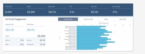
Image credit: Salesforce Trailhead
Key metrics visible from this dashboard are:
- The total number of emails sent, opened and the percentage of unique opens based on delivered emails.
- The total number of prospects who clicked unsubscribe and prospects who opted out in the Email Preference Centre.
- Percentage of how often forms are completed, the percentage of visitors who convert via forms (visitor-to-prospect conversions divided by total form submissions).
- The number of form submissions and the number of forms submitted via form handlers.
- The unique number of landing page views, percentage of submitted landing pages etc.
This dashboard is pulled from Pardot and combines metrics from the following datasets;
- Email dataset
- Email Template dataset
- Forms and Form Handlers dataset
- Landing Page dataset
Pipeline Dashboard
The Pipeline dashboard is to show the sales funnel from visitors to prospects to won opportunities etc.
This dashboard is probably most helpful for sales and marketing as it shows which assets and campaigns push the most deals.
At the top of the dashboard, we have the Lifecycle Snapshot’ and this shows the different stages; Visitors, Prospects, MQL’s, SQL’s, Closed Won. This is similar to the lifecycle report in Pardot.
The Pipeline Breakdown section shows Campaigns, Marketing Sourced Pipeline and Lead Sources. These graphs show the monetary value that is associated with opportunities’ individual campaigns, companies and marketing channels.
(Remember: the stage revenue originates in Salesforce).
This dashboard allows us to view the following stats:
- Total value associated with opportunities, not in Won or Lost Stage and the number of all opportunities not in Won or Lost stage.
- Percentage of new prospects compared to total visitors.
- Percentage of won opportunities compared to closed opportunities.
- ROI (percentage).
This dashboard is also pulled from Pardot and combines metrics from the following datasets;
- Opportunity dataset
- Campaign dataset
Marketing Manager Dashboard
This dashboard is for overall marketing performance. Its purpose is to show a quick look into the health of the campaigns and show which campaigns are yielding the best results.
The benefit to using this dashboard is you can simply drill into the Engagement Dashboard and the Pipeline Dashboard from it.
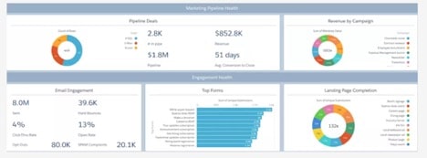
Image credit: Salesforce Trailhead
You can access the following metrics from this dashboard:
- Pipeline deals section - the metrics are combined from Pardot and Salesforce and show number of opportunities (not in won or lost stage), number of opportunities in SQL, Won and Lost stages, average close velocity in days etc.
- Engagement section - the metrics are primarily data from Pardot but do include some data from Salesforce such as the CRM campaign and user information. Here we can see the total number of sent emails, hard bounces, CTR etc.
- Included in the dashboard is the Revenue by Campaign’ doughnut chart which shows the sum of the monetary value of opportunities in the Won stage; grouped by campaign name. (Note: Whilst the stage values come from Salesforce, Monetary value is derived from the Value field on a Pardot opportunity.)
- The horizontal bar graph shows the Top 10 Forms’ - this is based on the number of unique form submissions.
- The Landing Page Completion’ doughnut chart shows the top 10 landing pages based on the number of unique landing pages submissions.
This dashboard combines metrics from the following datasets;
- Opportunity dataset
- Email dataset
Multi-Touch Attribution Dashboard
This dashboard shows high-level metrics at each lifecycle stage.
Within this dashboard, we can choose an Influence Model’ from the dropdown to see attribution and ultimately which marketing efforts are most influential during which stage of the lifecycle. Currently, we can only select Primary Campaign Stage’.
The purpose is to get a detailed view of marketing performance when the filters are used (filters include opportunity, account etc).
Use this dashboard to see:
- The sum of revenue of all Salesforce Campaigns and sum of value associated with all Salesforce Campaigns (this is another benefit to turning on Connected Campaigns and why we really need a coherent campaign hierarchy!).
- Sum of revenue share showing data points for each month.
- ROI and actual cost associated with selected campaigns (another reason why we need to make sure campaigns details are correct).
- Sum of revenue share, grouped by individual Salesforce campaign or by Salesforce campaign type.
This dashboard only uses data from the Multi-Touch Attribution Dataset.
Account-Based Marketing Dashboard
This dashboard brings together opportunities, contacts, marketing engagement and sales activities into one dashboard.
It includes an Account Details table alongside pipeline, opportunity and sales activities charts and the datasets used to create this dashboard are from Salesforce data!
This dashboard is really beneficial as we can choose an account to filter the widgets by, which updates the opportunity table and in doing so, we can view all the historical information associated with the account selected.
By using this dashboard you can access the following metrics:
- Pipeline value - the sum of monetary value associated with opportunities in the SQL stage for the selected accounts.
- The number of open opportunities associated with the selected account and the number of contacts associated.
- The average engagement score is the sum of Pardot scores divided by the number of scored contacts associated with the selected accounts (this is why scoring rules and degradation is so important).
- The number of sales activities for the selected account.
- Data associated with selected accounts, such as the account name, opportunity name, owner name, amount, account industry and close date.
(Note: To open an action menu just click into the account or opportunity or owner name).
This dashboard combines metrics from the following datasets;
- ABM Opportunity dataset
- ABM Contact dataset
- ABM Event dataset
Be mindful of data discrepancies:
With these pre-built dashboards, we hope you won’t find any discrepancies between the data in Pardot and the data in B2B Marketing Analytics Plus.
However, if things aren’t adding up it could potentially be down to the following:
Timezones may be the cause of data discrepancies
All pre-built dashboards use UTC but Pardot reflects the timezone of its primary user. Additionally, custom dashboards and datasets come from Salesforce so they will be using the timezone set in the connected Salesforce org (custom dashboards are something we will be blogging about in the future don’t worry!).
Updates!
Pardot data updates in real-time so it’s likely the numbers in Pardot reports are always up-to-date after a refresh of the page. This is not the case with the majority of pre-built dashboards. They update once every 24 hours and we cannot just refresh the page. Unless we are using the Account-Based Marketing dashboard or the Multi-Touch Attribution dashboard which can be manually updated as they are created from Salesforce data.
Archived Prospects
Unlike Pardot, the dashboards will include archived prospects, however, these can be easily removed from dataset formulas.
Email Templates unique click count
The dashboard counts a prospect’s first click for an email as a unique click. If the time frame is changed and the prospect had a second click during this timeframe it would not count it. Makes sense! However, the Email Template reports in Pardot will show the unique clicks on an email for a given timeframe and if the filter is then set for a different date range and the prospect did have a second click during that time, then it would still show as a unique click.
When choosing which dashboard to focus on or even share with the team, remember we want the audience to explore the dashboard and dig deeper into the underlying data.
Pardot says these pre-built dashboards can meet the needs of everyone on the team, whether they are sales-oriented or marketing-focused - and I’d have to agree.
The range of preset widgets and visualisations of metrics certainly cover marketing efforts and sales outcomes in one place.
If you have any questions on B2B Marketing Analytics set up or upgrading your app to Plus and would like some support please get in touch!